

This article was written by Guillaume Lorquet, an Atlassian Engineer at iDalko.
Work management systems like Jira have made collaboration between teams and companies way easier and smoother. Using Jira to its full potential and making use of its accompanying add-ons can especially make this collaboration much more efficient. For instance, if you’re looking for customizable charts and reports in Jira, then eazyBI for Jira will be your number one Jira add-on.
So in this guide, we’ll walk you through what eazyBI for Jira is and how it can assist you in creating reports and different types of charts in Jira.

What is eazyBI for Jira?
eazyBI for Jira is probably one of the most famous and powerful reporting add-ons for Jira on server, cloud, or even data center environments. But what does this tool offer? As documented on the vendor’s documentation: “Providing easy-to-use drag-and-drop creation of custom reports, charts and dashboard gadgets“.
Reporting here means collecting and presenting data in a view that makes it understandable and clear to analyze.
Some Terms and Concepts
An account is the first level in the tool. As a Jira user, you know the project and you could consider the eazyBI account as a Jira project. That’s the place where you will work, manage your data, and customize everything in your own way. It’s also possible to create a personal account only for you to define if you want to grant access to others or not.
A really nice point about Jira EazyBI is that aside from the Atlassian tools like Jira, you can also connect it to some add-ons like Insight, Tempo, Zephyr, Xray, and some more. Check out the official list here. So what about other external sources such as Database, Rest API, file, etc? No problem, let’s connect to the world with the external data sources.
Note that you can use the data that you import as it is imported to its own database to let you keep the history of the data. Well, that is totally different from Jira reports. Today, some fields could use historical values as status, assignee, and so on, but that wouldn’t be enough for many users.
eazyBI for Jira stores the data in its own database, so it lets you navigate through the history and find the required pieces of information among the old ones.
Now let’s take a look at the dimensions. Simply defined, the dimensions help you structure the information when you need it. Let’s just say that they are the information you can use and work on.
For example :
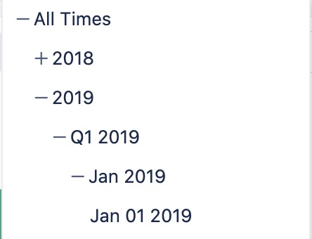
- If you want to get some information for a specific year, quarter, day or so, you have the ability to go to the first level (Year) and expand it until you get to that specific day. On this print screen, you can see my selection. I’m able to see the category “All times” and can expand it until I come to one specific day (Q119) from the year 2019.
- You can also use this to find specific pieces of information in your company’s hierarchical data. For example, you’re an employee → with a role → for a specific team → in a specific business unit.
Why use eazyBI?
eazyBI for Jira brings you a way to analyze your data and provide some reports. Jira also allows you to do that, thanks to its reports, dashboards, and widgets. But if you already use those functionalities, you probably know that you reach the limit really fast. That’s why a product like eazyBI for Jira is so helpful because it brings a new dimension to data analytics without the need for any other external powerful and complex tools.
It’s the solution for those who are looking for a more manageable and flexible Jira integrated solution to help them to track and manage things in a better way.

How to Get Started with eazyBI for Jira?
eazyBI for Jira provides good support and straightforward documentation. But imagine you don’t know the tool and you would like to test it beforehand. It’s not that difficult to install and test an add-on in Jira if you have the permissions and all the necessary things. With eazyBI, you’ll also need a specific database and configuration. And you probably don’t have access to that, or as an end-user, you don’t have the necessary knowledge.
But there is another way to let you get answers without asking; by letting you experience in a specific environment fully equipped with samples. Thanks to eazyBI, there’s no need to install a specific Jira or eazyBI, just find some samples and enjoy the experience directly on the demo environment!
They offer a lot of accounts, reports, and dashboards. But what is an account? Keep on reading to find out more.
Getting Started
Now that you have enough information on what eazyBI for Jira is, let’s see where the data comes from, how we can use it, and how we can manage our tools. Check out the platform proposed by EazyBI for more detail.
The very first steps are:
- Install eazyBI for Jira.
- Configure the source.
- Import the required data.
- Create an account.
Now, go to the “Analyze” menu and create a new report. Here, you can also structure your reports into folders.
Once your report is created, you can go ahead and customize it.
Manage the Information
How to use all the information and where to store it might be one of the most challenging parts for beginners.
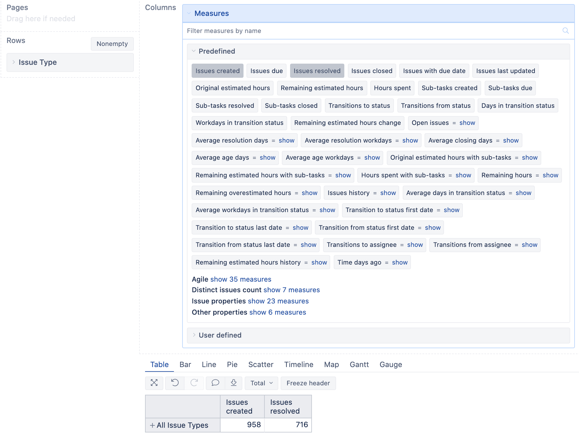
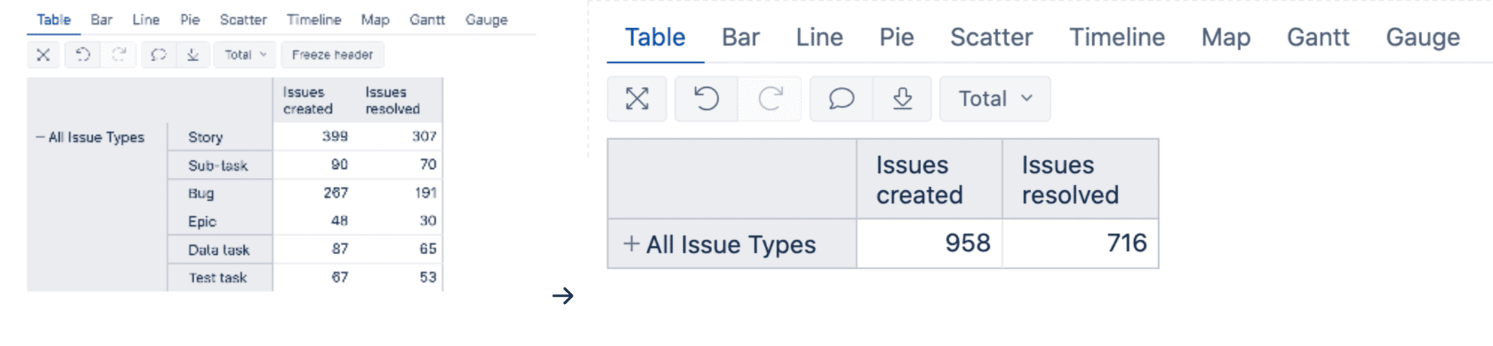
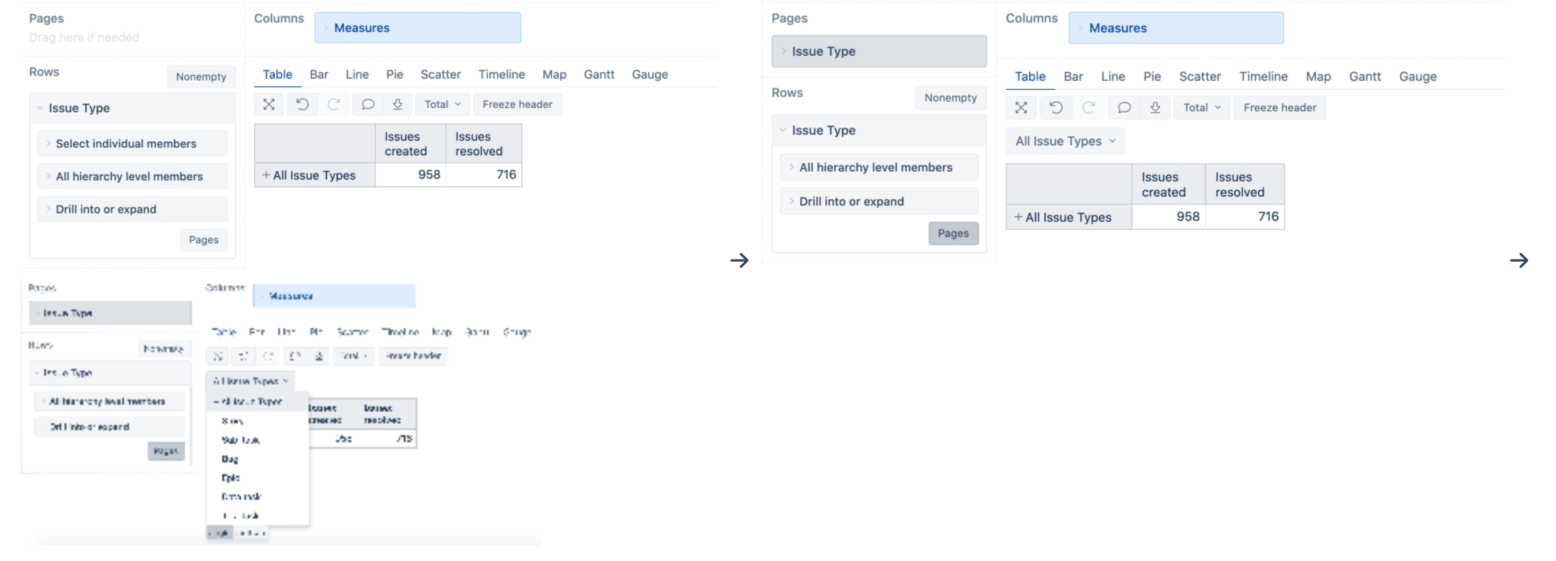
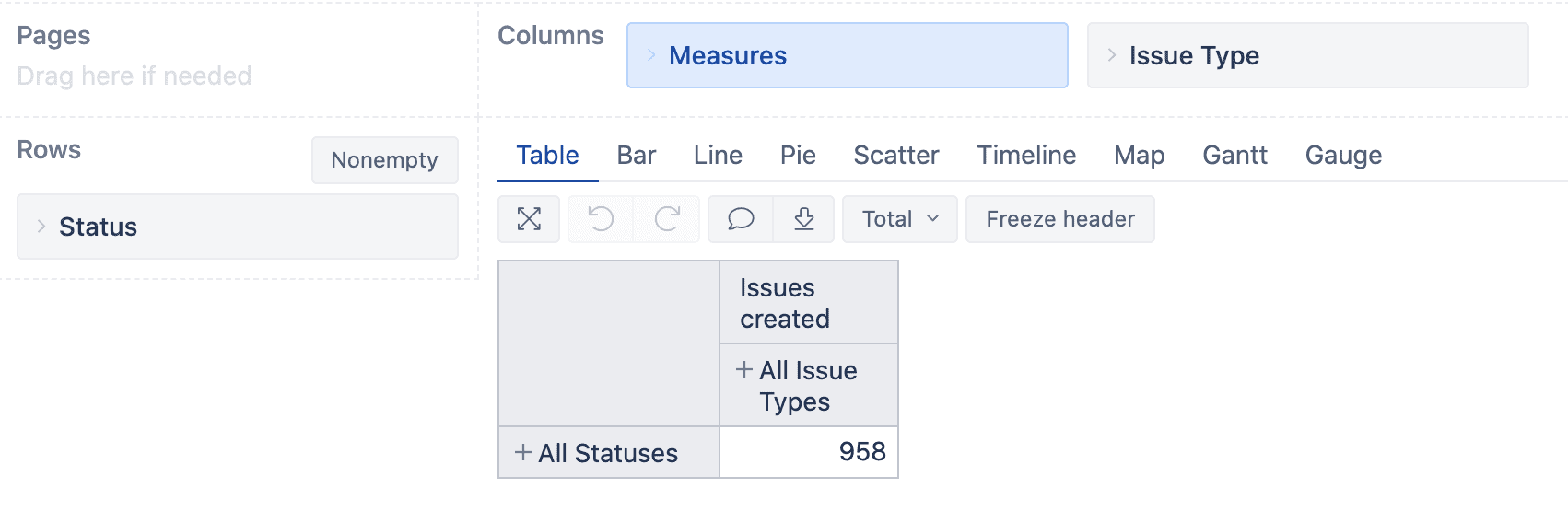
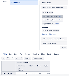
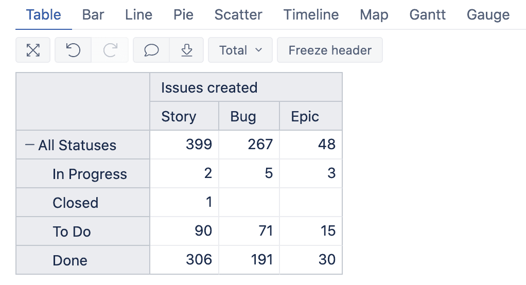
When you configure your import, you may select what you want to appear as a dimension. So what you use to create your report can be something like the fields. Fields are associated with some properties. For example, Issue type could be all/ Standard/ Sub-tasks/ etc. That’ll help you when customizing your reports. Just drag and drop the dimensions to “Column” or “Rows” to generate information in your table based on the information you want to analyze.
In our example, we drop our “Issue type” dimension to the “rows” part that generates a table with a total of all issues created.
It’s probably not enough, so the next step will be to improve our table. If you intend to get all the issues created and resolved, go to “Columns” and expand the “Measures”. Then you’ll get all properties of the “Measures”. Click on “Predefined” to get all the predefined options and select “Issues resolved”. You have now added a second column in your table.
How to Use Bar charts in eazyBI for Jira
We talk about reports and not tables, so let’s convert our information into a report to compare the final result. On top of the table, you can find some tabs like “Table”, “Bar”, “Line”, and so on. Click on “Bar” and let the magic happen and convert your table into a nice bar report.
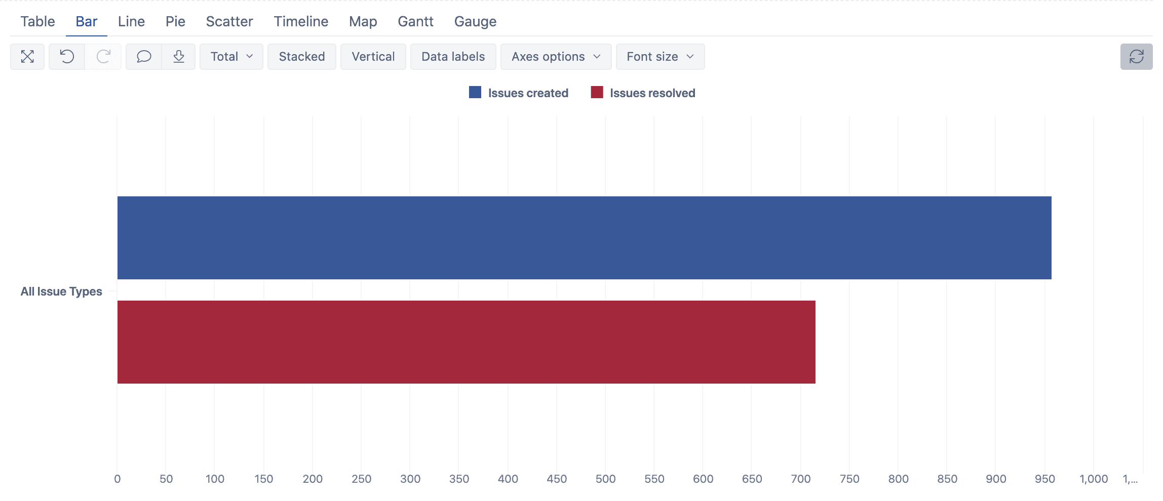
You might probably be familiar with this. As you can see, it’s really efficient given the fact that you can hover over the bars with your curser and see how dynamic it is and what you can directly get from the graph.
Let’s improve this report and update the colors. It might be a good idea to assign a green color to the resolved issues. So click on the red part in the title. The color menu drops down, and thanks to EazyBI’s latest update on color code, you can pick more colors and even use color code. Go ahead and select a green one.
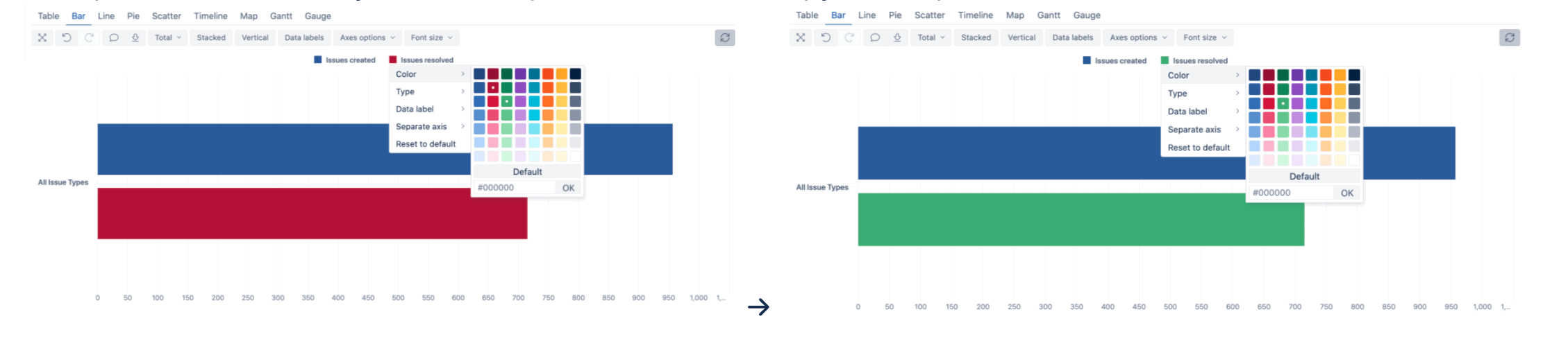
Looks better, right? You can now tell which issues are resolved and which are not.
- Let’s do it on a graph. Click on “All issue types” and “Drill into level”.
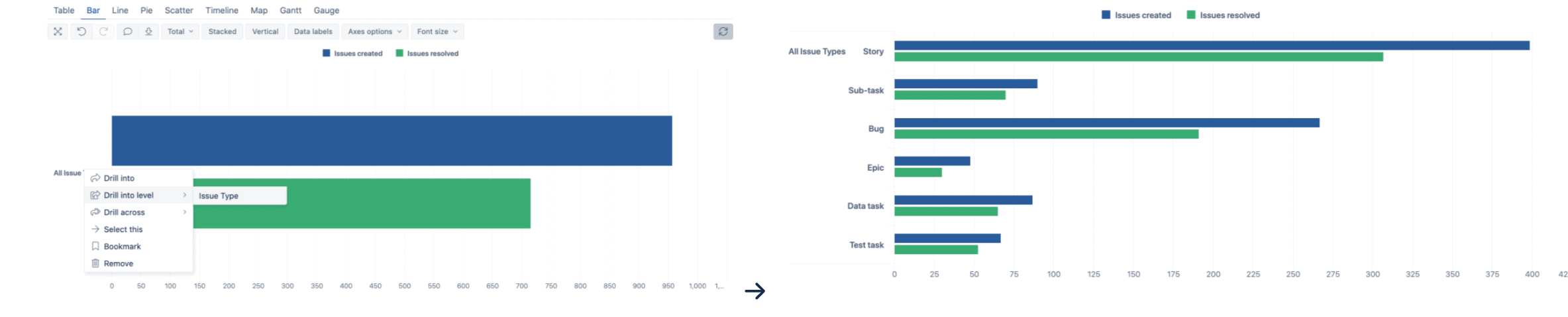
- Go back to your table and see the result. Yes, it updates the information automatically. Sometimes it’s really easy to do it on the graph, sometimes it’s better to do it in the table. But the important thing is to never do it from scratch. You better always save the current situation and keep going. In case you don’t want to, just click on the “-” next to “All issue types” on the table side and you’ll access all the information.
- You probably prefer to choose what issues you want to work on. So from the “Rows” menu, expand “Issue type” and click on “Pages” at the bottom of the list. It’ll automatically be added to the “Pages” menu. That also adds a filter to the top of your table which will help you select what issues you want to view.
- This new menu will let the user select which issue type to view in the report. If you go back to your graph, the filter is still there and you can see all the issue types. Select one specific issue type to get the report as you want. For example, you can pick “Bug” and get the report only for the bug:
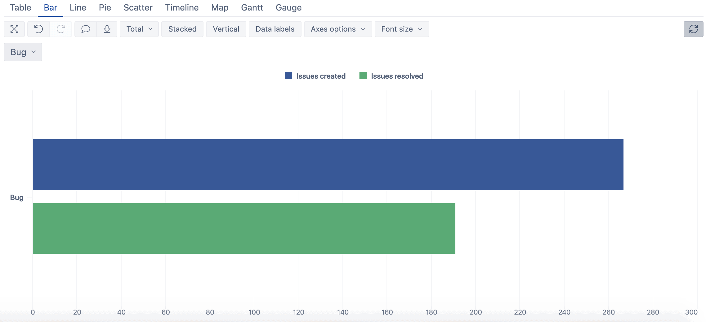
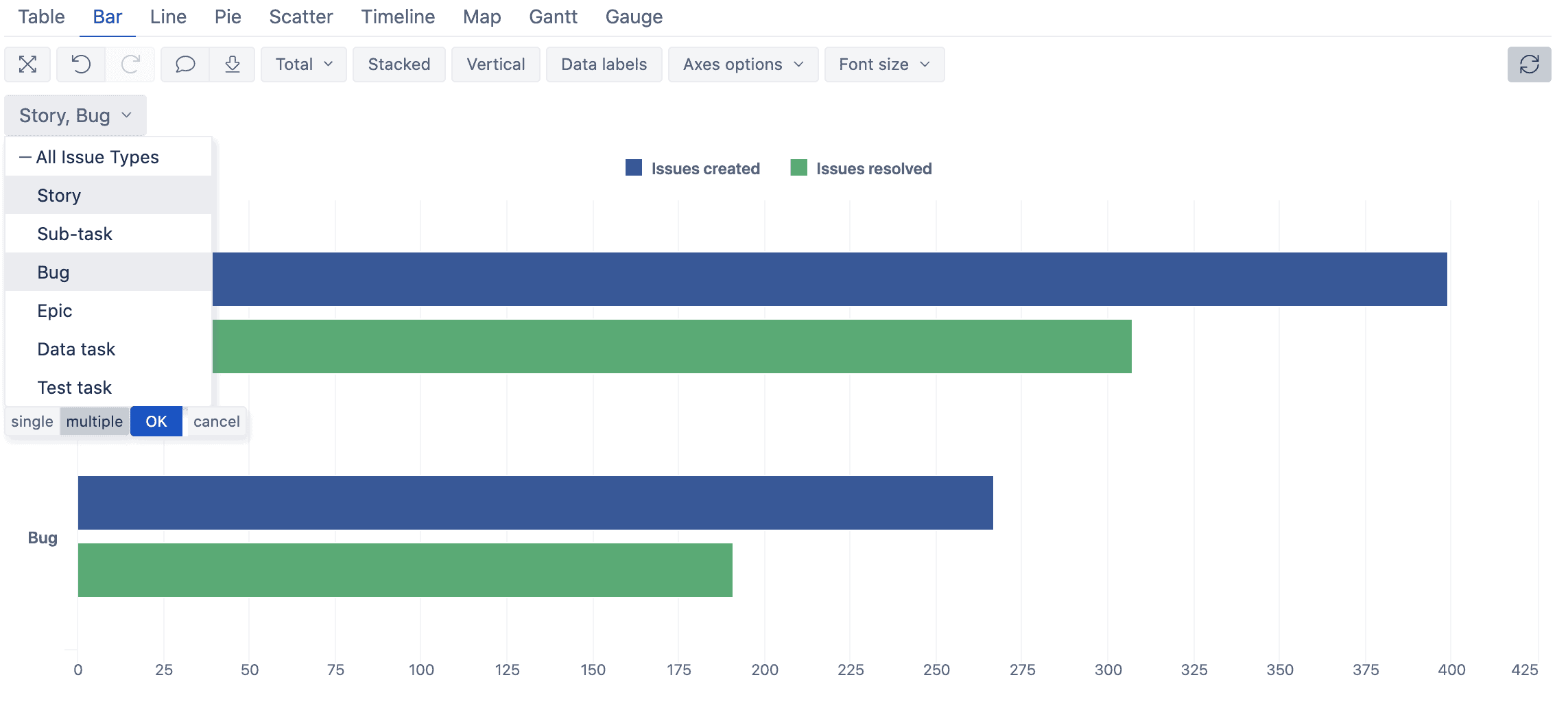
As you can see, the filter takes the value that you selected as the title of the axis. The number of issues is updated accordingly, too. - If you want to get more than one issue type, for instance, you want to know how many stories you are working on vs. how many bugs, go to your filters. At the bottom, you can switch from “Single” to “Multiple” values selection. Choose multiple and click on “Story” and “Bug”, then click “Ok”.
How to Create Pie Charts in eazyBI for Jira
Ok, now you’re able to generate your own report with the required information and filter it. Let’s see if we could still improve this. Now, you might want to get a report with a specific issue type and its status with a pie chart. Let’s say the story, epic, and bug. First, clean up, and then you can start from scratch.
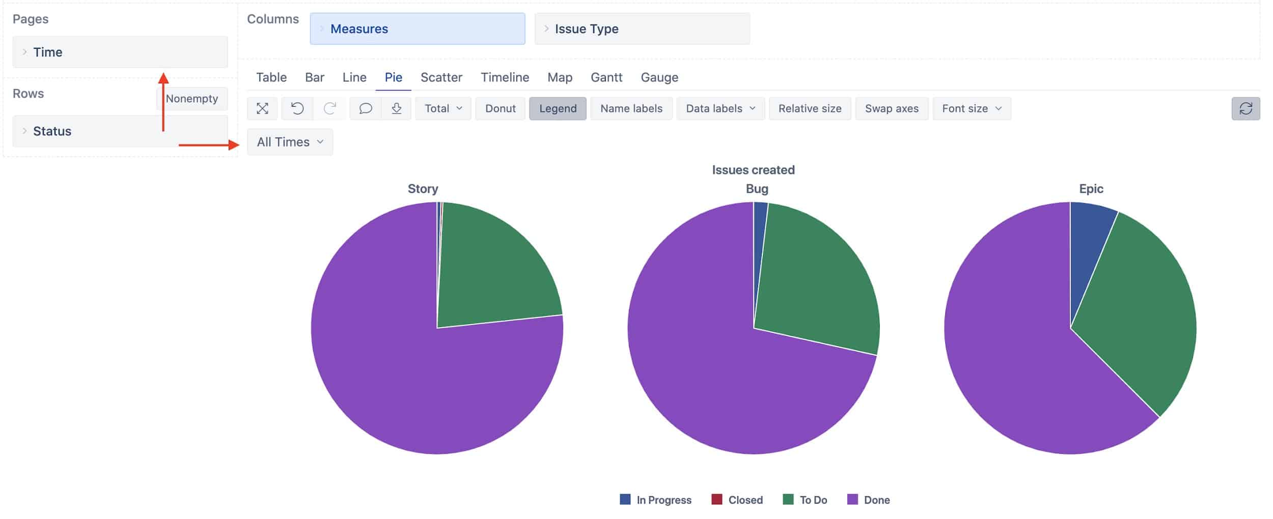
- Drag and drop the “Issue Type” dimension to the “Columns” part, and “Status” to “Rows”.
- Expand “Issue type” and unselect “All issue Types”, but select “Standard issue types”. Go to your table and expand “Standard issue types” to get what was expected.
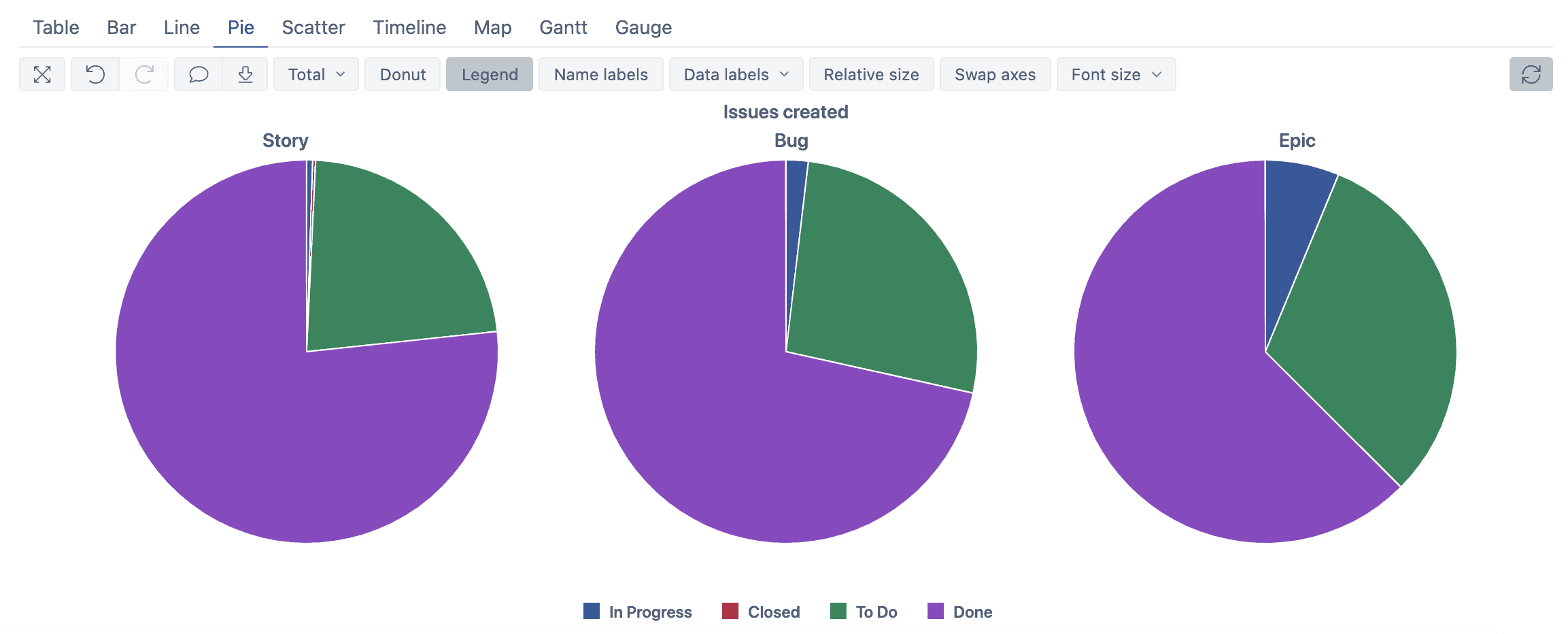
- Now, let’s convert to the “Pie” chart by using the “Pie” tab. As you can see, the result is not bad but we’re going to remove all unnecessary things like “Standard issue types” (represent the total of issues) and “All statuses” that represent 50% of our pies.
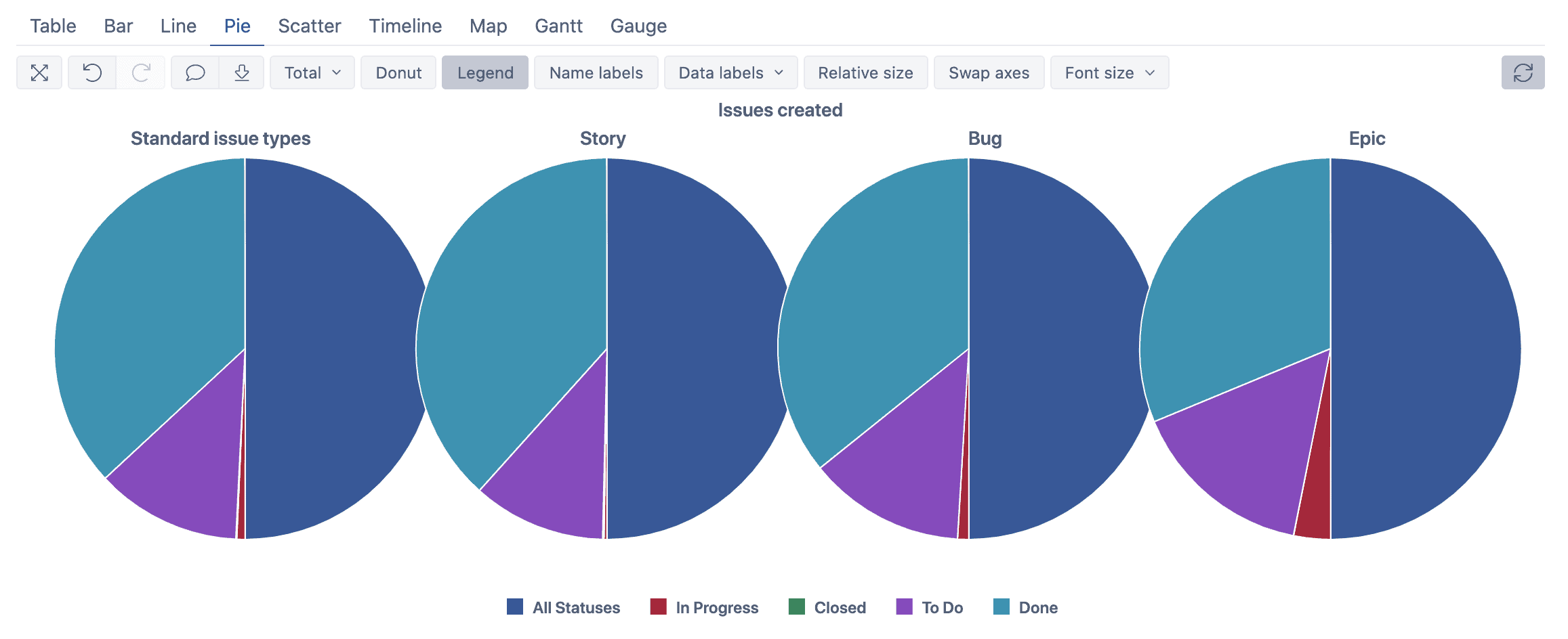
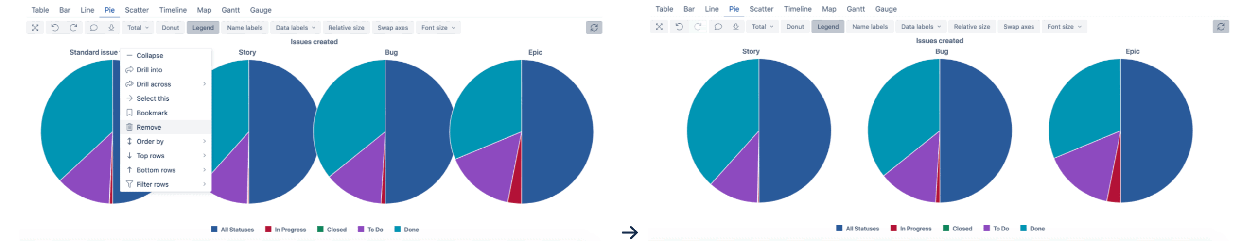
- You can do it from the pie chart directly by clicking on the item that you want to move. Here, we’ll remove “Standard issue types” by clicking on it and selecting the “Remove” option. You go from 4 pie charts to 3 pie charts.
- This time, we’ll do it from the table. So, go back to your table. You can see that has been adapted and the “Standard issue types” column has automatically been removed.
Now, remove the “All statuses” information. To do so, click on “All statuses” and select remove.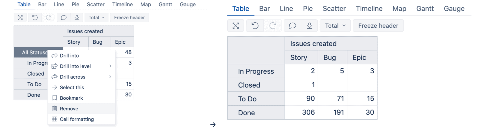
- You can do it from the pie chart directly by clicking on the item that you want to move. Here, we’ll remove “Standard issue types” by clicking on it and selecting the “Remove” option. You go from 4 pie charts to 3 pie charts.
It’s probably not necessary to mention that the pie charts are also updated and you get better information.
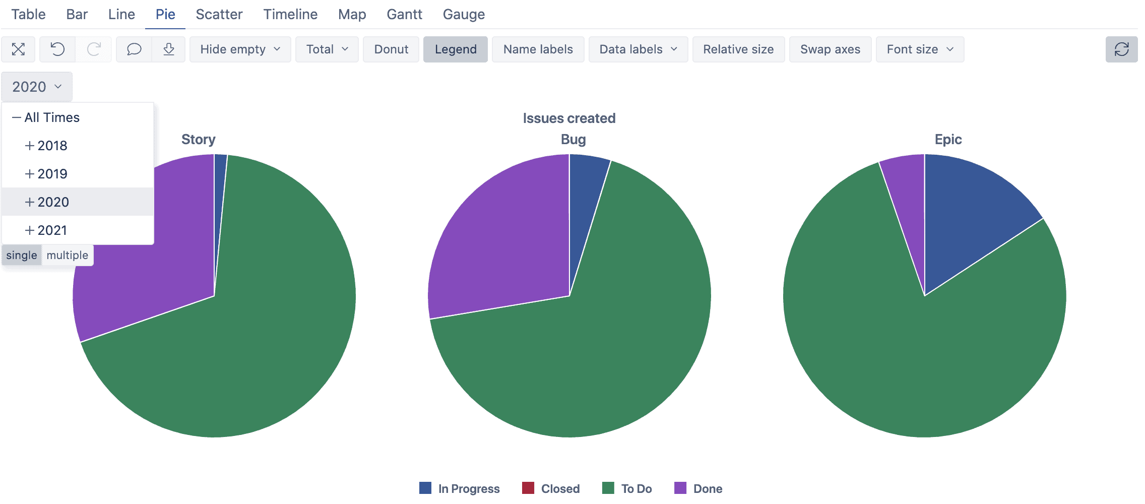
- Looks great but as you can see, there are still a lot of “Done” issues noticeable on the Pie chart. That’s why we’re going to use filters again, this time to report a specific period. One easy way is to use the “Time” dimension, use the “Pages” option to access the filter.
If you select the year 2020, you’ll get all the information related to this year. And as you can see, the slice of the done issue becomes different now.
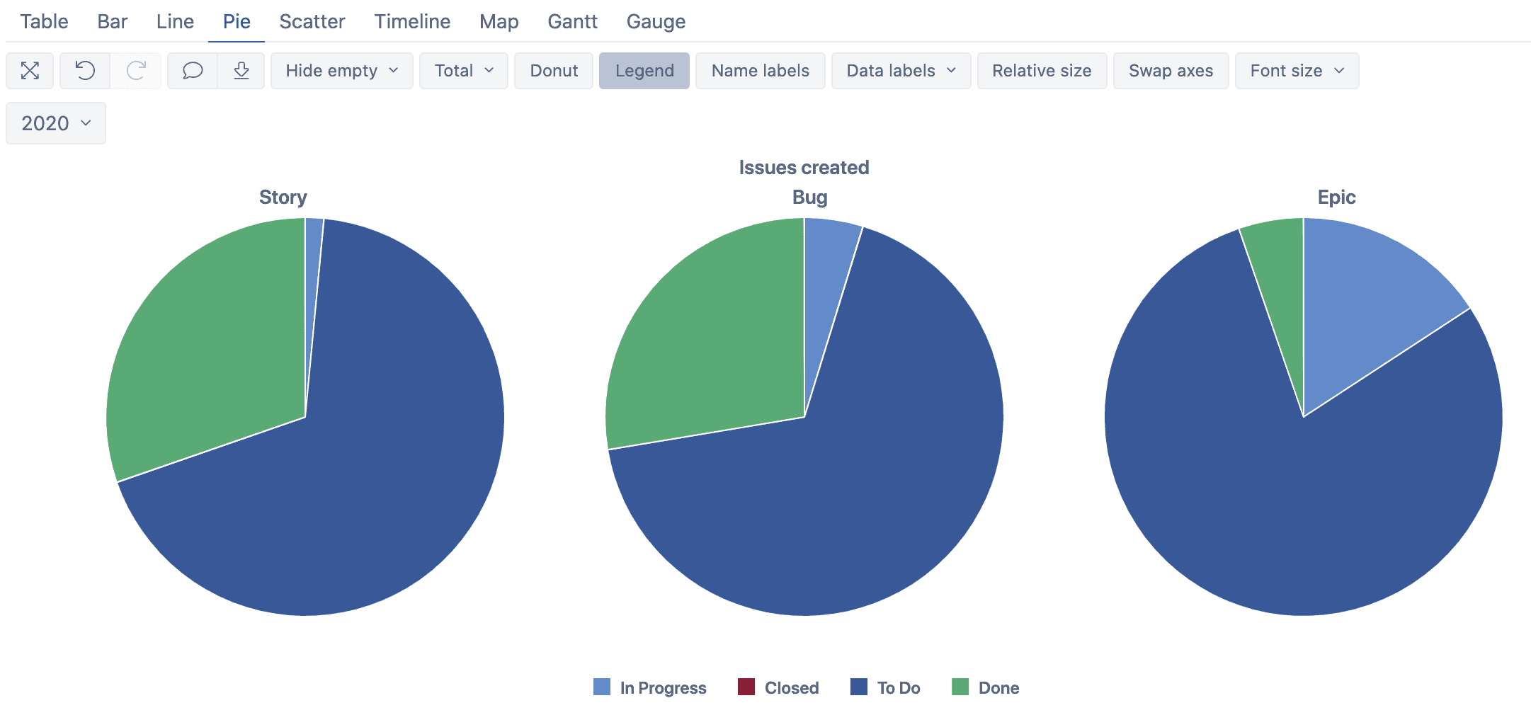
- Here, we’re going to pimp our charts up a little bit. Change the colors to get something more appropriate as Jira proposed.
- Sometimes it’s not enough because you have so much information. You can then add some labels to help you understand the values of your charts. Just use the “Name labels” option to make them appear, then improve it directly with the “Data labels” and select the ones you prefer. Here, I suggest that you use “Values and percentage” which will give you the number of tickets and the percentage.
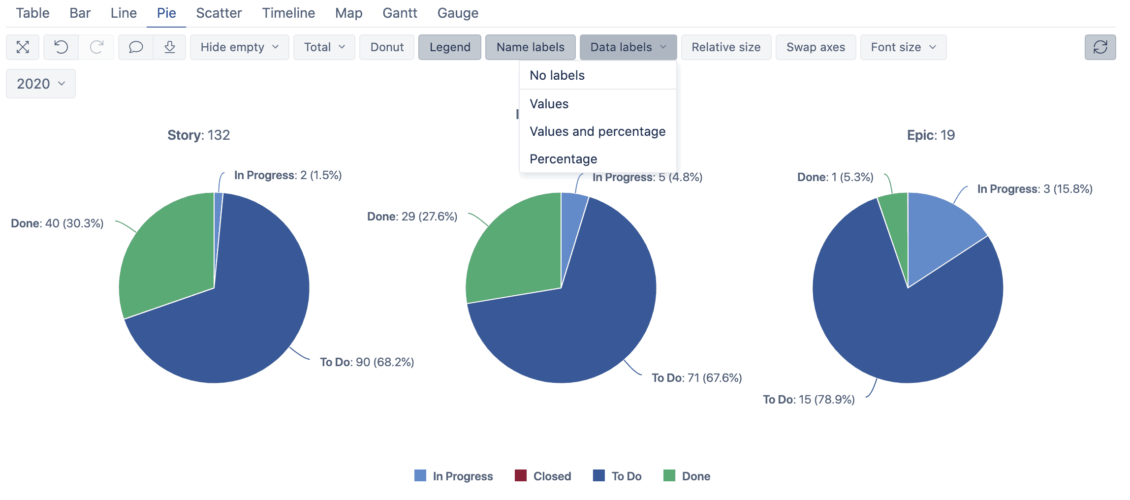
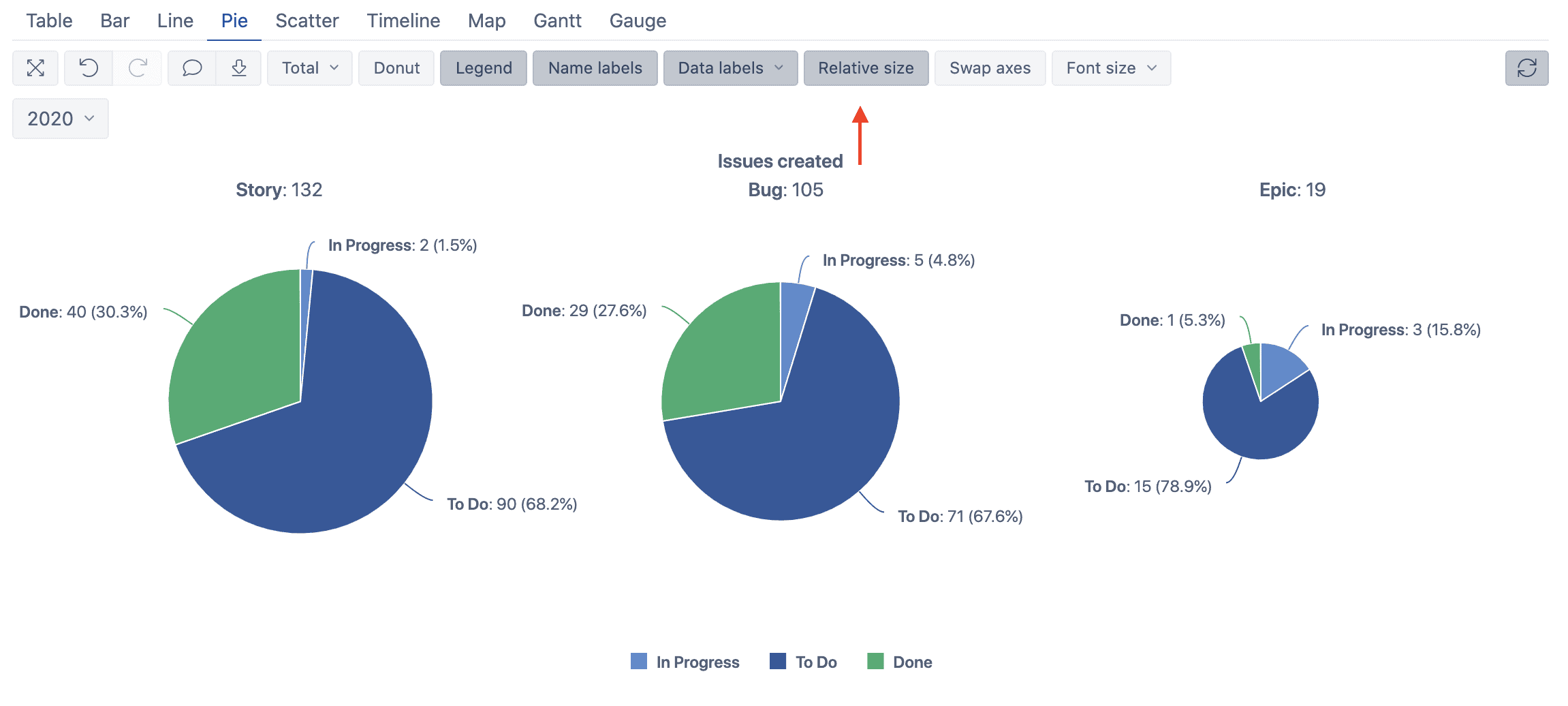
- There are not a lot of “Closed” tickets here, so you can just remove this status from the list. Now you know how to do it: From the table or from the graph directly. There’s also another option called “Relative size”. If you activate it, you see that the size of your charts becomes smaller or bigger depending on the number of issues. Epic is only 19, so it becomes smaller. The story is 132, so the result is going to be a bigger chart.
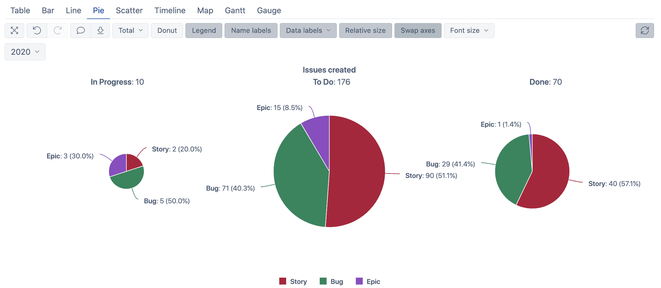
- The next option in eazyBI for Jira is “Swap axes”. This one can be useful if you want to know the amount of the issue types depending on their status. Imagine you’re working a lot on stories, but not so much on bugs. Let’s say, you’ve more than 50% of your story done and still have a huge quantity of bugs that represent 50% of your progress and 40% of your backlog. If you check your done issues, something like 40% of your work done is related to bugs. It’d be best if you consider having fewer bugs and fix as many of them as possible.
How to Adapt Line Charts in eazyBI for Jira
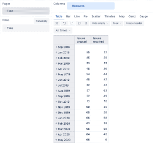
If you manage a support team, for example, you might probably be more interested in created tickets than resolved tickets during a period. Start from scratch, and use only 1 dimension and 2 measures (Issue created, Issue resolved).
- First, use the “Measures” as a row and select “Issue created” and “Issue resolved”. Then, use the “Time” dimension as columns and pages. Note that if you don’t, the configuration will completely be different.

- You now have the result and we’re going to expand the “Time” information into months.
- Go on to the “Line” tab to get your graph and assign colors to the tickets: resolved as green and created as red.
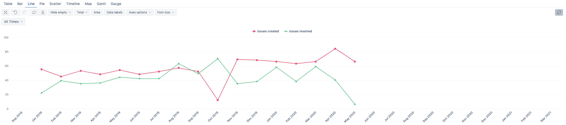
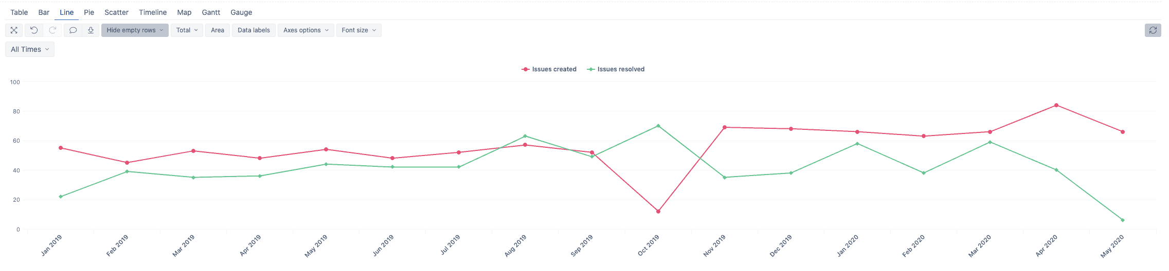
- As you can see, the graph presents the dates without any information. Use the “Hide empty” option to hide them. Select “Hide empty rows” in our case.
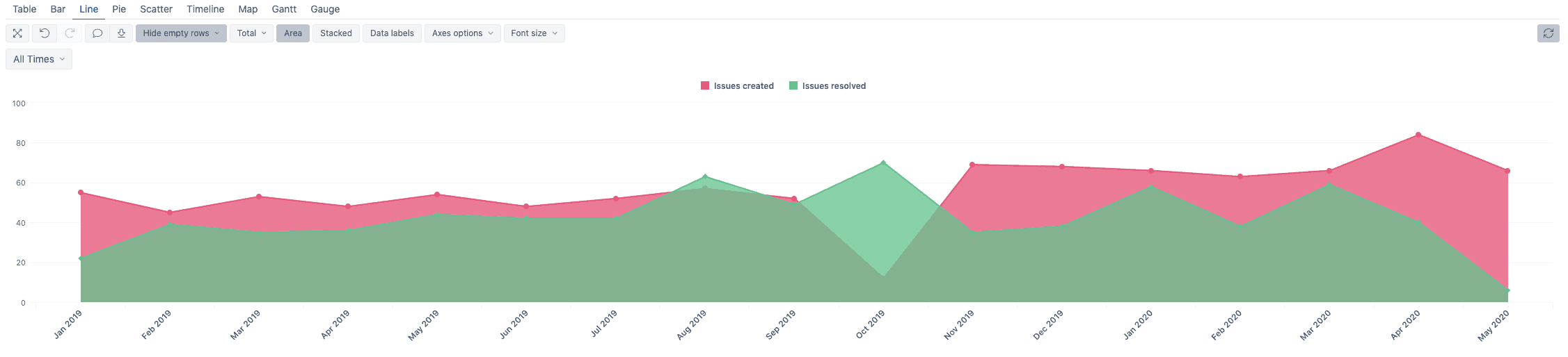
- You might probably assume that is it, but you can still improve it by using the “Area” option.
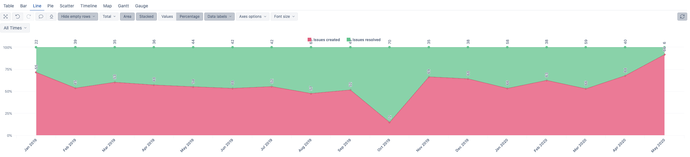
- If you use the “Stacked” option and select “Percentage” instead of “Values”, you’ll get a report that shows you the percentage of the issue Resolved vs. the Created. It’d be really useful if you want to get a quick view of the situation during a period. Add the “Data Labels” option and the “Values” to get a full report of the Created vs. Resolved.
Conclusion
In this article, we went over some first steps to start with EazyBI for Jira and to use it. There is still a lot to do, try other reports, use MDX (language used to customize the reports), save your reports, and create some dashboard. To learn more about the reports in eazyBI, you can take a look at the reports proposed by EazyBI.
Recommended Reads:
- Insight for Jira: The Comprehensive Guide to Asset Management
- The Comprehensive Guide to Xray for Jira: The Leading Test Management Tool
- The Ultimate Guide to Tempo Timesheets for Jira
- GDPR: The Complete Guide to Compliance Regulations in Jira
- Essential Jira apps for Successful Collaboration across Teams and Platforms